
Bringing clarity and discoverability to complex filtering in HubSpot
Role:
Senior Product Designer
Team:
1 Product Manager
3 Software Engineers
Timeframe:
6 months
Cut list processing costs by $75K, improved accuracy by 300%, doubled event trigger speed, and boosted report-building efficiency by 1.5×.
I partnered with the PM and tech lead to define the scope, strategy, and roadmap, ensuring clear alignment across teams in the US and Ireland. I ran workshops, led user research and usability testing to inform key decisions, and kept the design systems team updated on new components throughout the implementation of the updated system.
The Problem
Users struggle to find and understand information due to an ineffective information architecture and navigation system. Content inconsistencies across the platform further complicate the experience, forcing users to waste time navigating between sections in search of clarity, often resulting in frustration.
Additionally, existing technical debt imposes constraints on potential solutions, limiting the ability to make meaningful improvements and deliver a seamless, user-friendly experience.
Why is it important to help customers find information quickly and effectively?
Helping customers find information quickly and effectively prevents inefficiencies, reduces processing costs, and enhances the user experience. When customers struggle to access the right data, they create multiple lists, workflows, and reports, leading to system strain and frustration. This not only increases costs but also contributes to customer churn. Streamlining data access improves usability, efficiency, and overall satisfaction.
The Solution
To enhance the user experience and address key challenges, we implemented strategic improvements focused on discoverability, usability, and system-wide consistency.
Early research helped us validate ideas that focus on making it easy to find, understand, and interact with information ensuring a seamless and consistent experience across the platform.
Strategic approaches

Improved Discoverability
Restructured the filtering navigation and refined the information architecture based on user mental models across different apps.

Enhanced Usability
Introduced contextual help along user journeys to boost user confidence when selecting filter properties.

Holistic Design Approach
Adopted a platform-wide mentality in designing the filtering experience, ensuring a cohesive and intuitive interface.

Cross-Team Collaboration
Worked closely with other teams to reconcile solutions at the system level, aligning on a consistent user experience across HubSpot.
Discovery
To get started, I took a deep dive into the current system, looking at everything from interaction design and user interface to common pain points—especially for those using filter-consuming applications. My goal was to spot any usability gaps and areas that could be improved. To back this up with real user insights, I analyzed Customer Satisfaction (CSAT) feedback from the last 90 days, identifying recurring trends and specific concerns.
Themes
Improvements
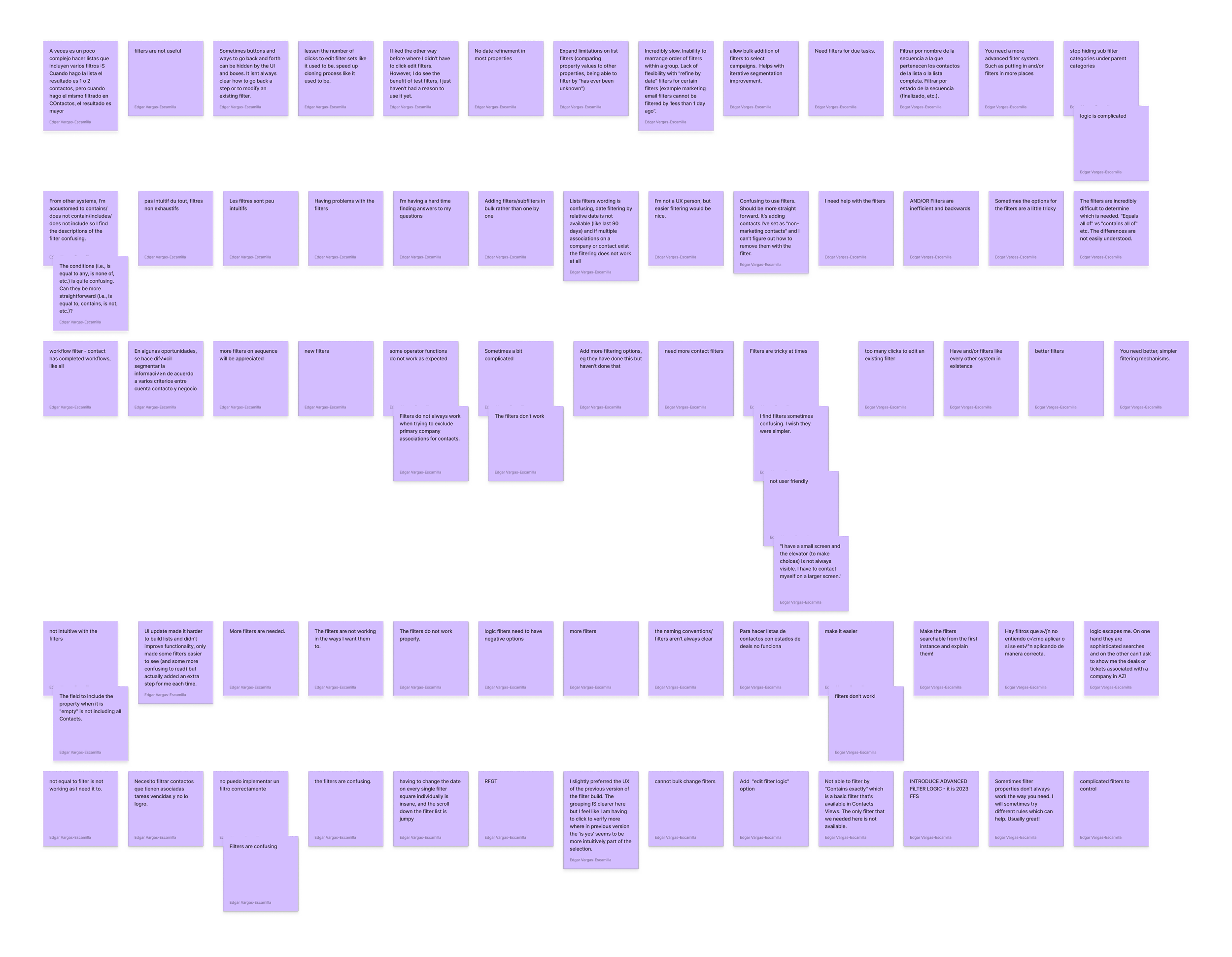
Users find the filtering system confusing and inefficient due to unclear terminology, malfunctioning filters, and limited customization options. They want a more intuitive, flexible system with better navigation, functionality, and support for complex filtering tasks.
-
Users find the filter properties confusing and often not functional, with issues like unclear terms and inefficient AND/OR logic. Specific filters, such as "not equal to," fail to work as expected, and sub-filter categories are hard to locate. Overall, there is a need for more intuitive, searchable filters with clearer descriptions and more straightforward conditions.
-
Users are requesting more advanced and flexible filter options, including the ability to bulk add or change filters and implement "edit filter logic" features. There is a clear demand for additional contact and sequence filters, as well as the ability to apply negative logic filters and filter based on task completion or workflow status. Overall, users want a more sophisticated, simpler, and more expansive filtering system to improve segmentation and customization.
-
Users find the filtering system challenging and unintuitive at times, with issues such as excessive clicks, confusing wording, and difficulty with date filtering. There is a desire for a simpler, faster filtering experience, including easier navigation and the ability to rearrange filters within a group. Additionally, users are frustrated by the UI updates, which have made it harder to build lists and added extra steps, while also lacking flexibility in certain filters like date refinement and filter visibility on smaller screens.
-
Users face significant challenges with the filter system, citing confusion and difficulty applying filters correctly, especially when trying to segment data across multiple criteria like contacts, accounts, and deals. Some filters, such as excluding specific associations or filtering by task status, do not function as expected, and essential options like "Contains exactly" are unavailable. Overall, the filtering experience is seen as non-intuitive, requiring more straightforward functionality and better support for complex list-building tasks.
Enhancements
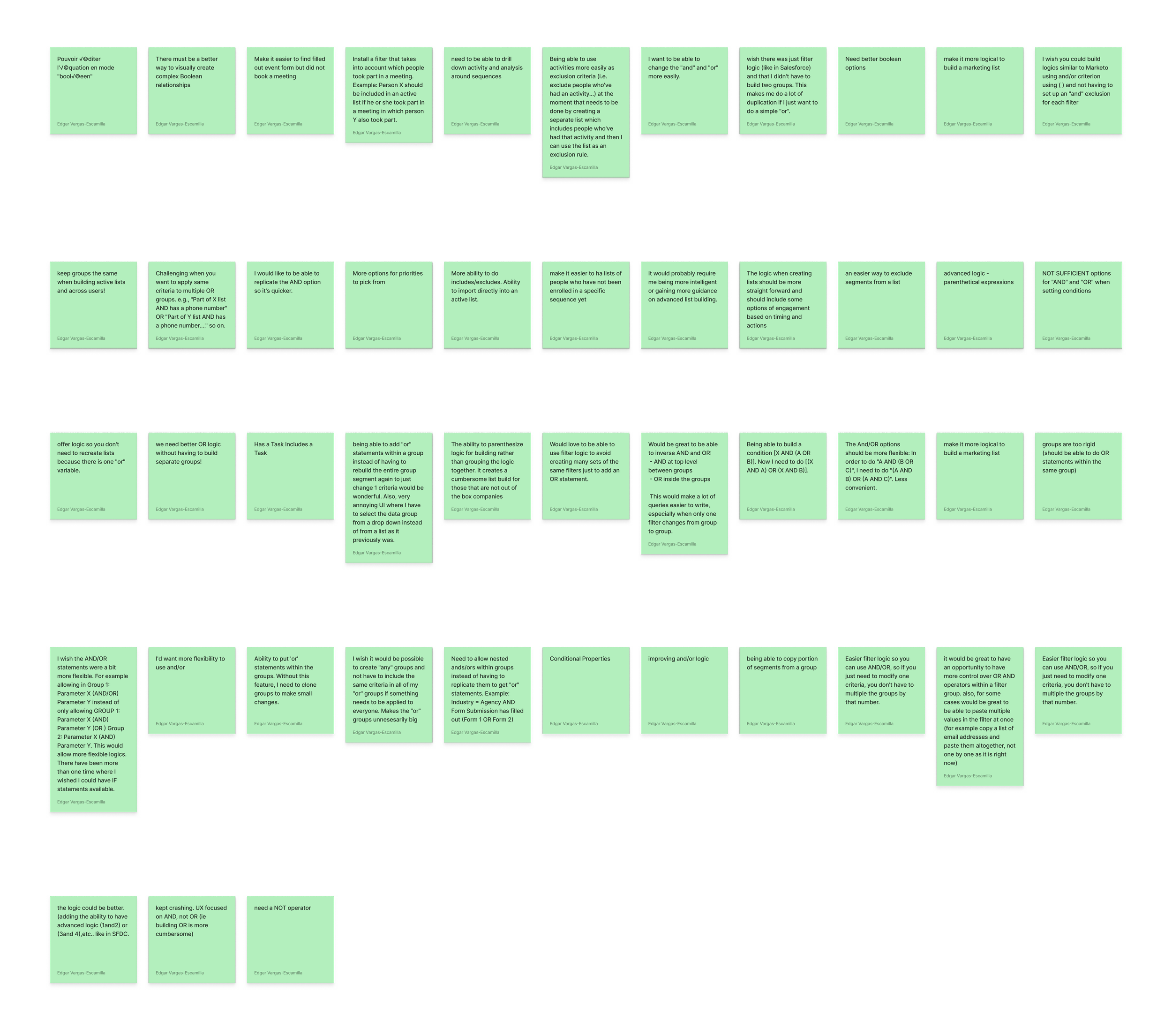
Users want advanced filter logic, including nested AND/OR statements, replicating criteria across groups, and easier filter management. They also seek better tools for excluding segments based on actions, improved group consistency, and more intuitive ways to build marketing lists with complex Boolean relationships and activity tracking.
-
Users are requesting more flexibility and control over the AND/OR filter logic, particularly the ability to apply "OR" statements within the same group without having to duplicate or rebuild entire segments. They would like to be able to create more complex conditions, such as nested AND/OR logic or the ability to quickly replicate or modify criteria across multiple groups. Additionally, there is a desire for simpler filter building, better control over the operators, and improved functionality, such as allowing bulk additions or pasting multiple values, to streamline the process and reduce unnecessary complexity.
-
Users are seeking a more intuitive and logical approach to building marketing lists, particularly when it comes to including or excluding specific segments based on actions, activities, or timing. They want simpler ways to exclude individuals based on past activities, such as creating exclusion rules without needing separate lists, as well as filters to track meeting participation or incomplete actions, like event form submissions. Additionally, users desire better tools for activity analysis, more control over group consistency across users, and the ability to import directly into active lists to streamline the process.
-
Users are requesting more advanced and flexible logic options for building filters, particularly the ability to use parenthetical expressions to create more complex Boolean relationships, similar to tools like Salesforce or Marketo. They want greater control over AND/OR logic, with the ability to build conditions like "(1 AND 2) OR (3 AND 4)" and more options for prioritizing criteria. Overall, users are seeking better Boolean functionality that allows for easier creation and editing of complex filter logic without the need for cumbersome workarounds.
Complexity
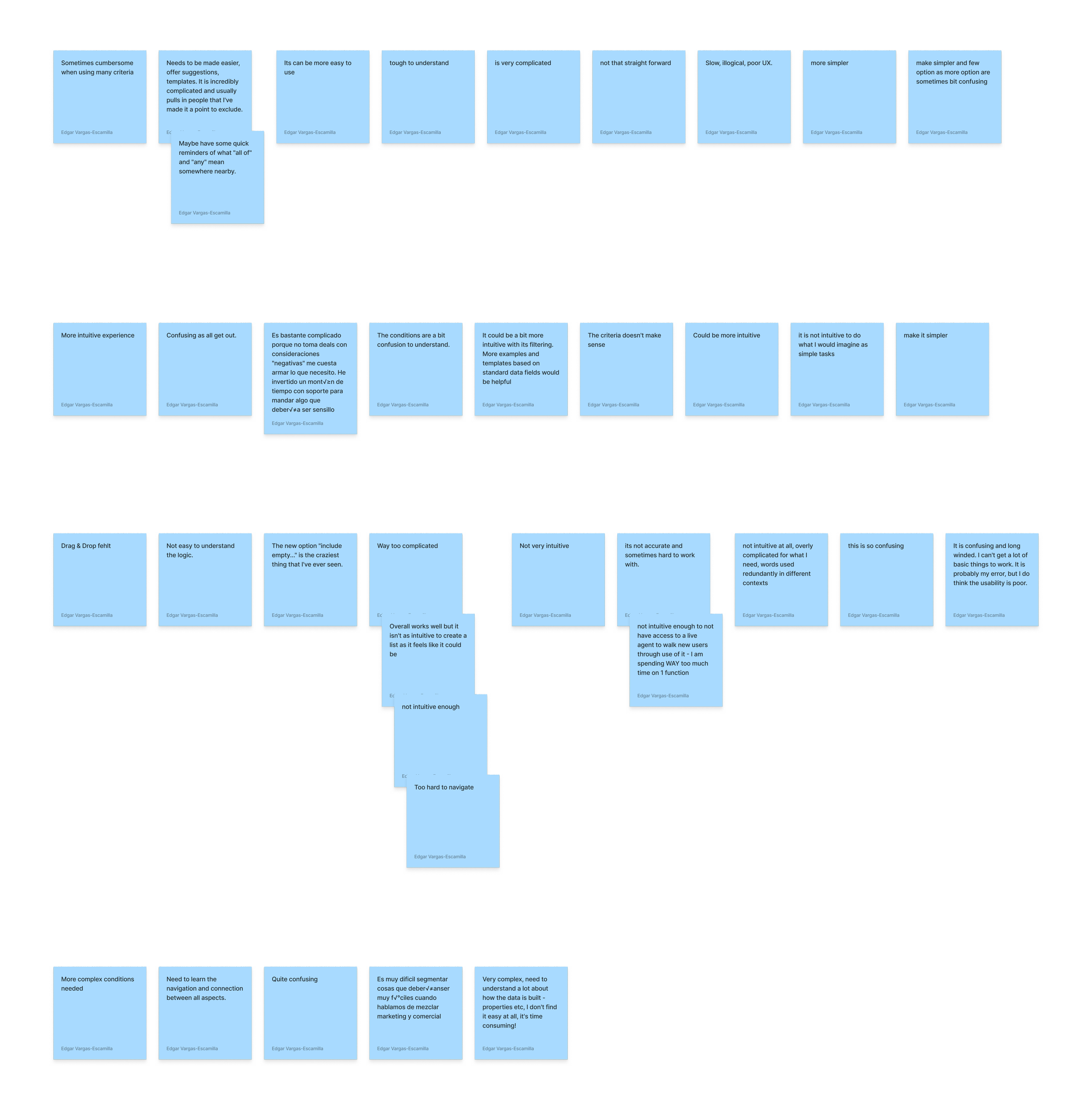
Users find the system confusing and complicated, struggling with unclear navigation, redundant terms, and complex data segmentation. They want a more intuitive interface with clearer explanations, helpful templates, and quicker support to improve usability.
-
Users find the system confusing, overly complicated, and not intuitive, often struggling with basic tasks and spending excessive time trying to understand the functionality. Many feel the user experience is poor, with redundant terms and navigation challenges that make even simple tasks feel cumbersome. Overall, users seek a more intuitive, efficient design that requires less time to learn and navigate, with a better user interface and quicker access to support.
-
Users find the system confusing and difficult to understand, particularly when it comes to navigating and connecting the various aspects of the platform. The conditions and logic for segmenting data are often unclear, making it challenging to create the desired filters or perform tasks that should be straightforward. Overall, there is a strong need for simpler, more intuitive functionality to make the process easier to grasp and use effectively.
-
Users feel that the current filtering system is overly complicated and not intuitive, with features like the "include empty..." option causing confusion. There is a strong desire for a simpler, more user-friendly experience, with suggestions, templates, and reminders to help guide users through common tasks. Additionally, offering clearer explanations for terms like "all of" and "any" would improve usability and reduce confusion, making it easier to exclude or include the right contacts.
Customer interviews
I spoke directly with existing customers to hear firsthand about their challenges and frustrations. This mix of data and real conversations gave me a well-rounded understanding of what’s working, what’s not, and where we can make meaningful improvements to create a smoother, more intuitive experience.


Key Insights:
Customers seek the ability to manage and customize the data displayed before initiating searches for specific properties, events, and workflow triggers.
When organizations work with multiple custom objects, customers default to search functionality.
The absence of continuous improvements through in-app communication negatively impacts user adoption.
Competitive Intel
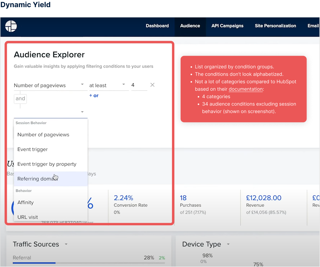
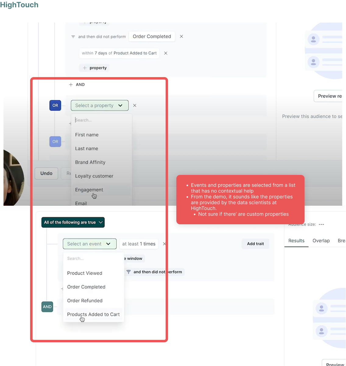
I conducted a competitive analysis of seven companies, including Simon, Dynamic Yield, Amplitude, FullStory, Customer, Hightouch, and Dinmo.
The audit revealed that while most systems organize lists by groups and conditions, they generally lack contextual guidance to support user understanding
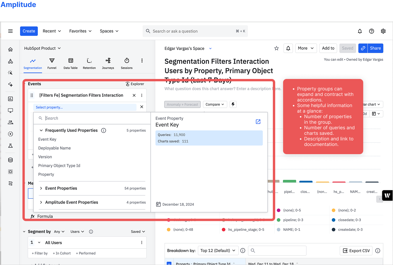
Key Insights:
Few competitors provide detailed information about events and properties within their UI.
Most interfaces follow a simple list-based structure, organized into categories.
FullStory and Amplitude stand out by offering the most effective contextual guidance within their UI.
System Audit
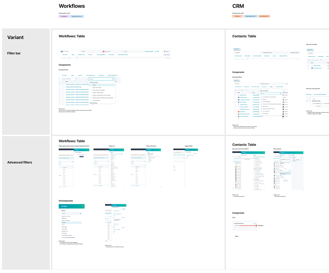
Conducting a UI system audit is essential for identifying inconsistencies and improving user experience across products. I performed a comprehensive audit of HubSpot’s Reports, CRM, Index, and Lists sections, analyzing how filters were implemented across these areas. By systematizing the audit, I was able to compile a detailed list of discrepancies, highlighting a major pain point—customers had to relearn how to use filters depending on the product section.
This insight not only revealed key frustrations but also provided an initial direction for unifying filters into a cohesive platform-wide experience, ensuring greater consistency and ease of use.
Amplitude data
Amplitude provided an additional layer of data that allowed me to analyze user behavior over the past 3–6 months. Through this analysis, I gained the following key insights:
Key Insights:
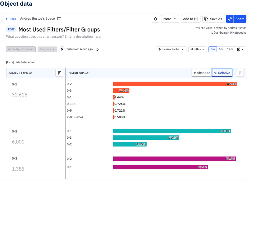
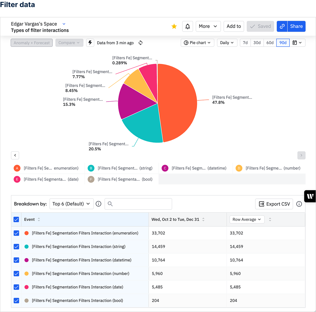
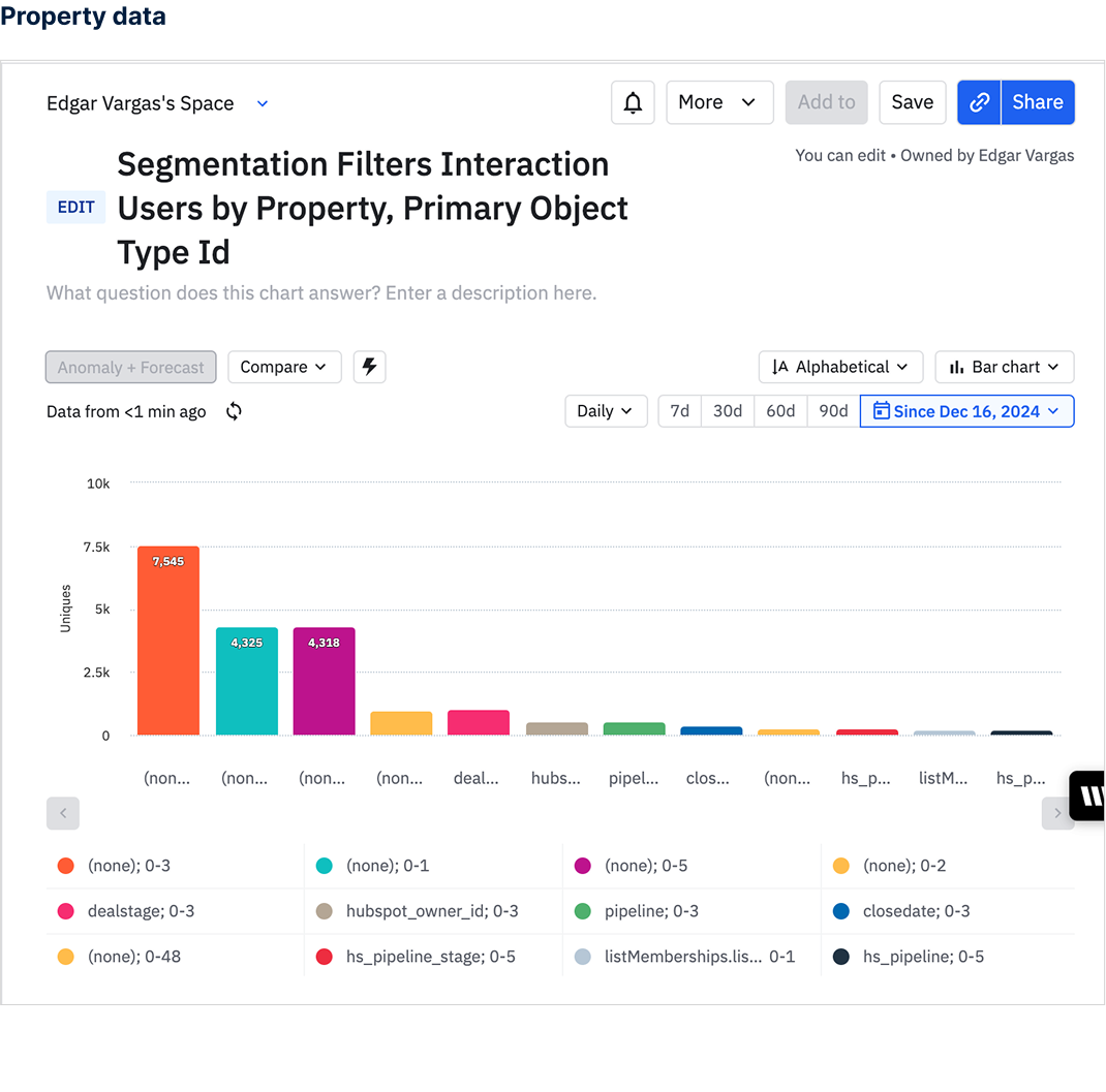
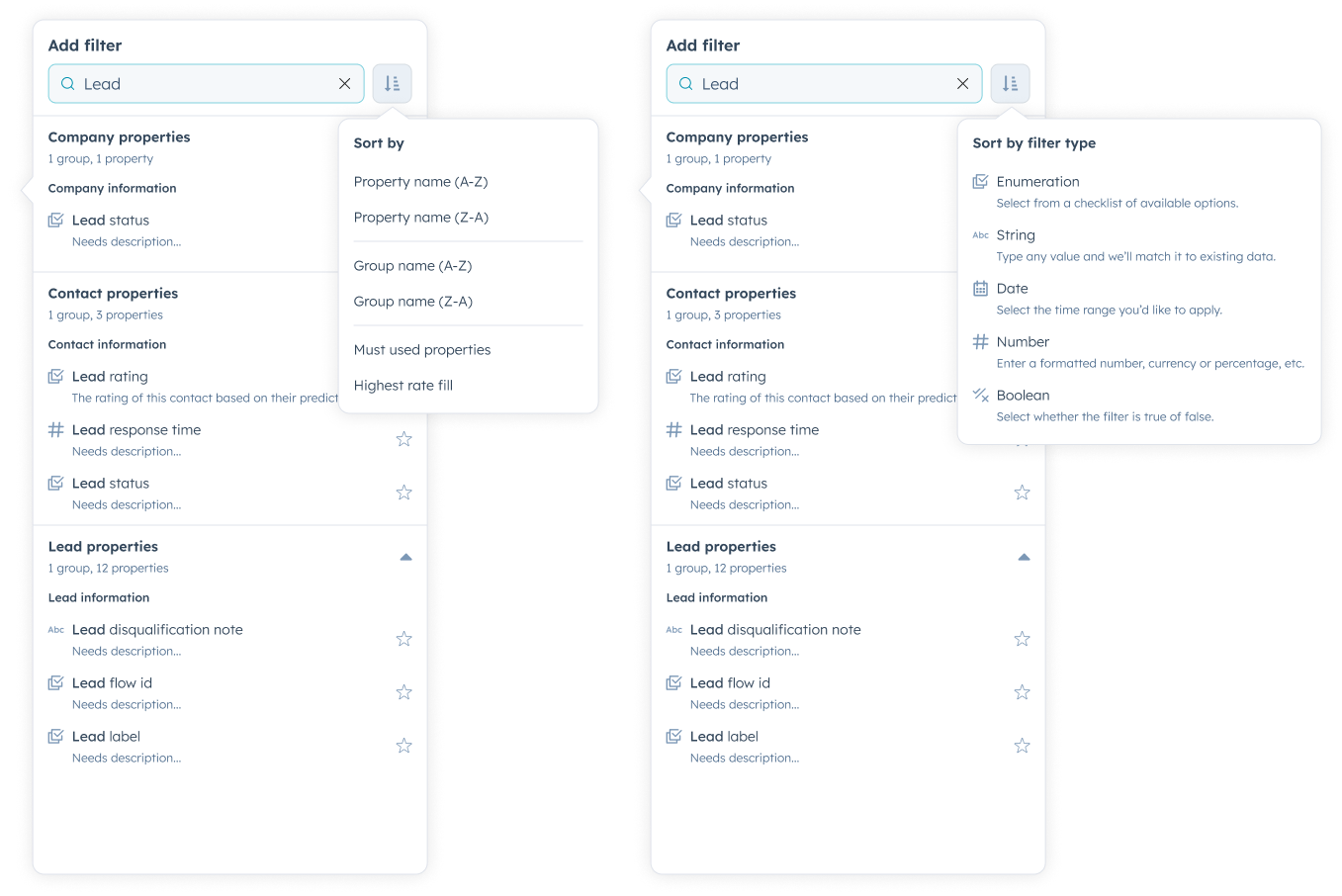
List Creation Journeys – Most lists were created using contacts, companies, or deals objects. This insight guided my design decision to prioritize and default to these objects at the beginning of the list creation process, streamlining the user experience.
Top Filter Usage – The three most frequently used filters during this period were enumeration, string, and datetime. This finding informed the information architecture of the property selection, ensuring that these filters were more accessible and intuitive for users.
These insights helped drive data-informed design decisions that improved usability and efficiency in the product.
Definition
Once we had a clear problem definition, I teamed up with another designer to improve two key parts of the data segmentation process—setting up filters and validating segments. Through our weekly design sessions, we shaped a vision for the initial experience of the new segmentation studio.
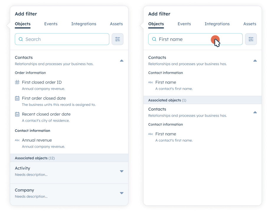
Information Architecture
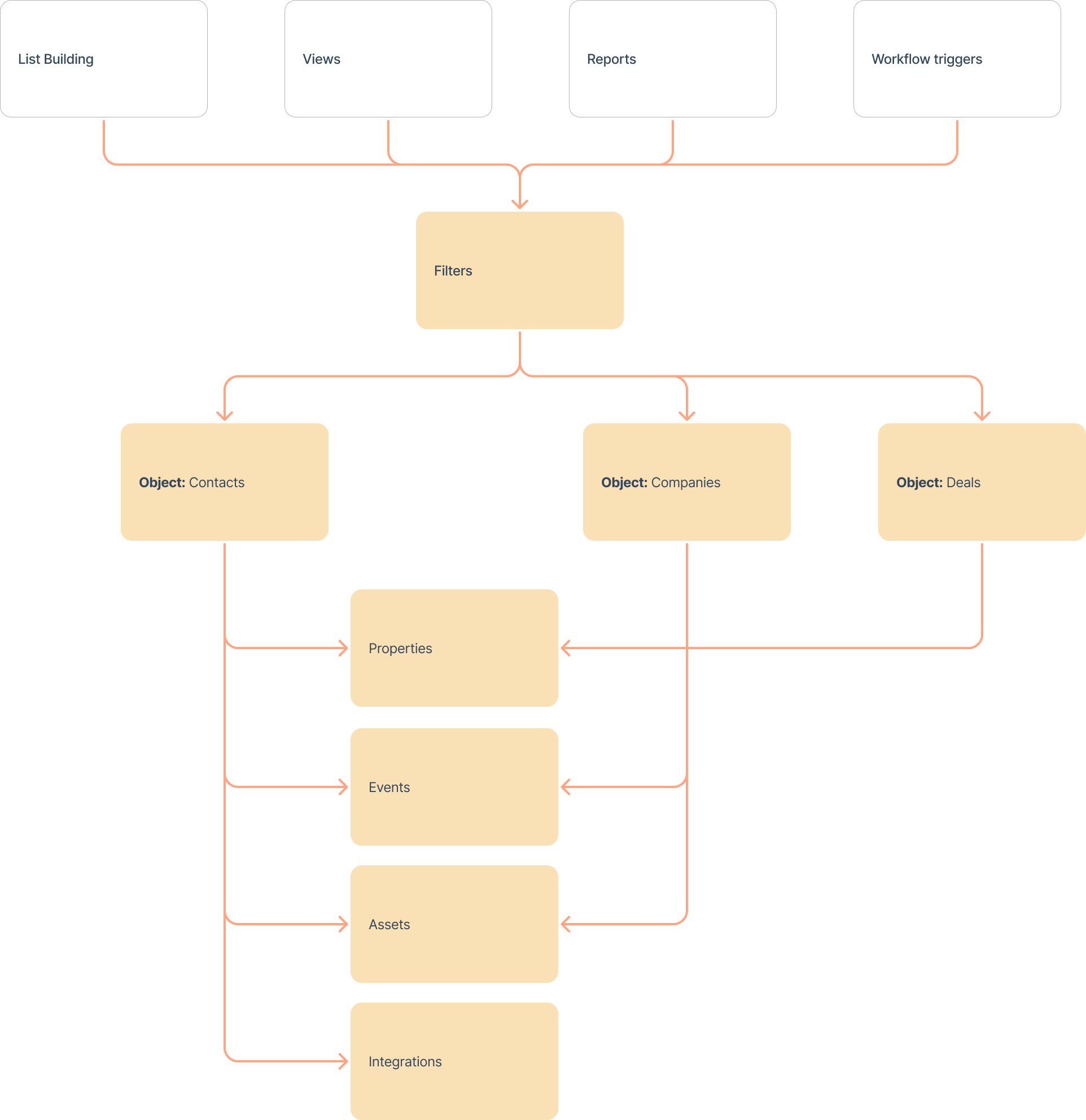
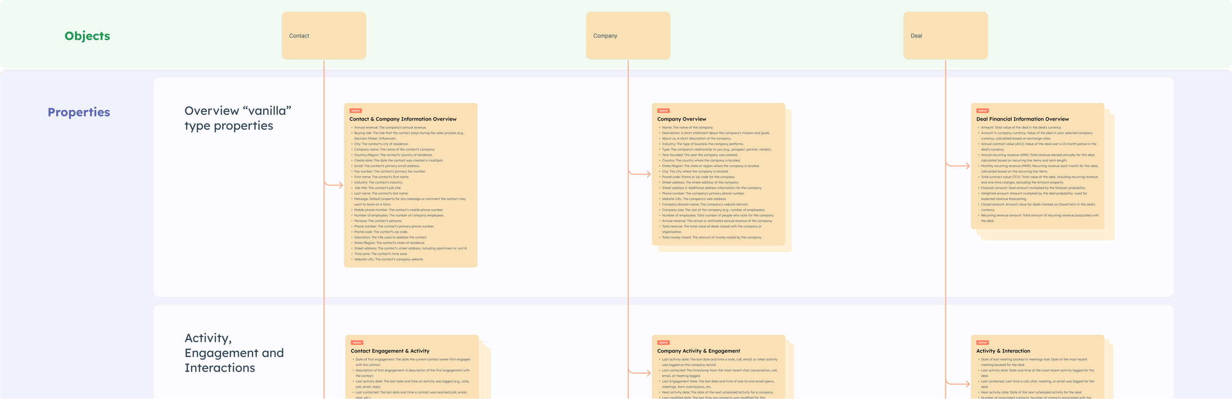
In HubSpot, all data is structured as records, which are associated with objects, and each object contains properties that customers use to build lists, reports, workflow triggers, and more. However, the foundation for creating anything in HubSpot begins with selecting an object.
Leveraging Amplitude data, I conducted a card sorting exercise with customers to test data groupings for each object. This allowed me to create new, more intuitive groupings that better align with user needs and priorities.
Property information architecture
Low fidelity designs
Low-fidelity wireframes played a key role in my design process, allowing for rapid ideation, collaboration, and alignment before refining high-fidelity designs.
Key benefits:
Quick Iteration: Partnered with another designer to explore multiple starting points and user flows efficiently.
Cost-Effective Alignment: Enabled early validation of ideas before investing in high-fidelity designs.
Collaborative Process: Simplified wireframes encouraged stakeholder input and team alignment.
Focus on Structure & Flow: Prioritized navigation, user goals, and layout decisions to build a strong foundation.
Userflow 0.1
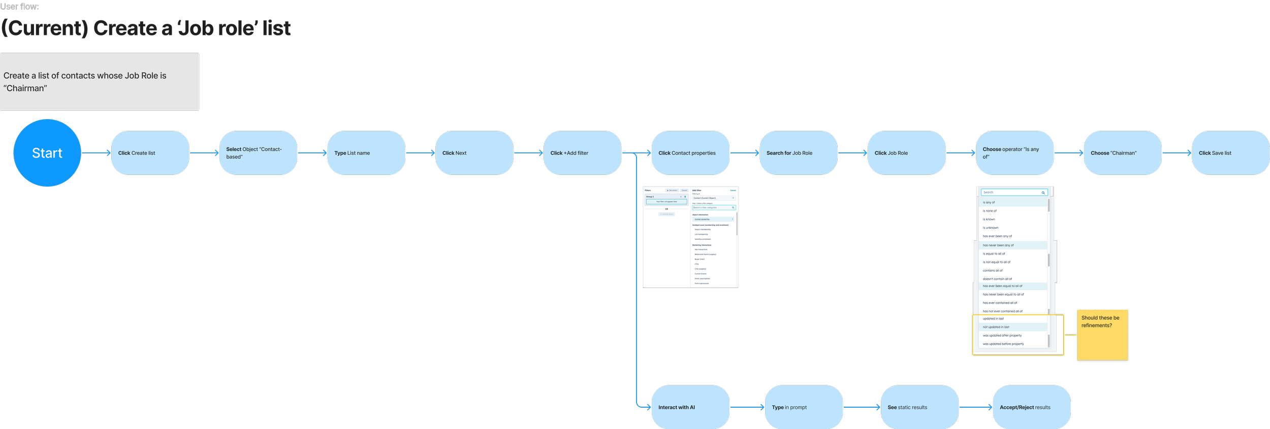
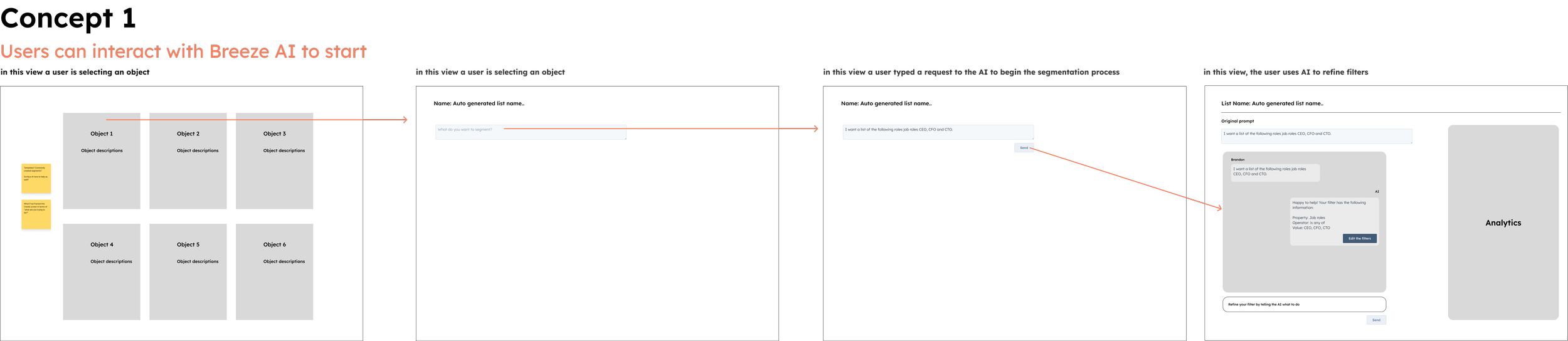
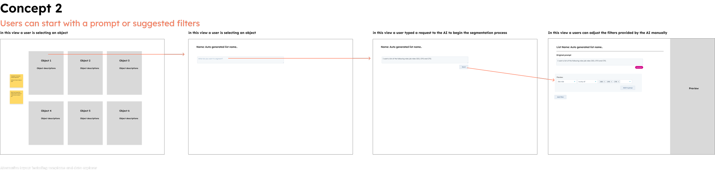
Low fidelity concepts

Refinements
From there, I continued refining and iterating on ideas until we arrived at two solid solutions. To ensure they effectively met user needs, I conducted a usability test incorporating open discussions, prototype walkthroughs, competitive analysis of different search approaches, and property data validation.
This process also involved refining key elements, including different navigation paradigms, object selection and prioritization, content sorting, contextual and AI-driven assistance, and search capabilities spanning local, global, and hybrid models.
Local, hybrid, and global search
Contextual help
Vertical navigation
AI paradigms
Horizontal navigation
Data sorting
Studio context
User testing
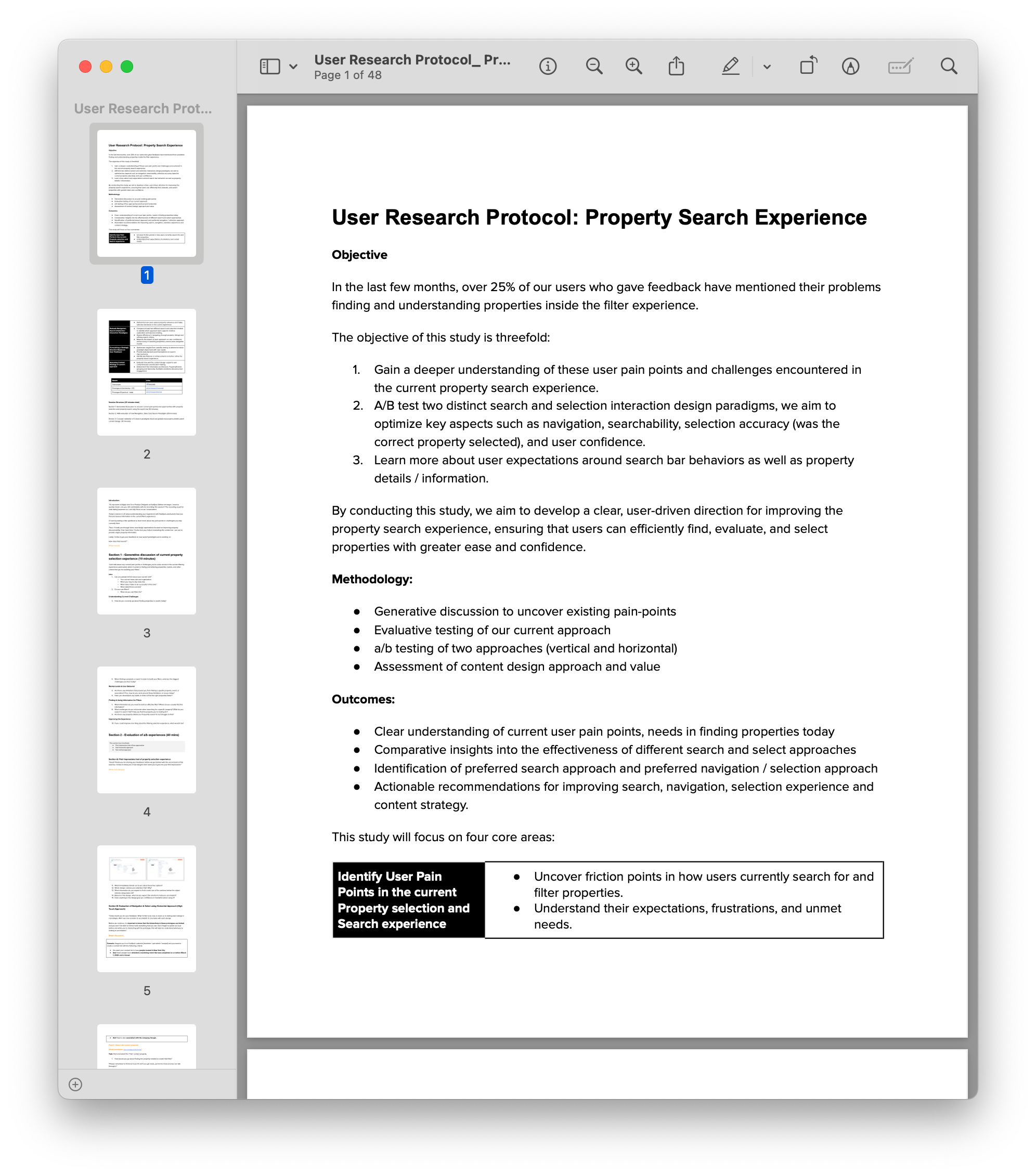
To better understand user challenges with finding and interpreting properties, I facilitated a generative discussion with customers to identify key pain points. Based on these insights, I designed an A/B usability test to evaluate two different approaches for property discovery and comprehension.
Additionally, I presented three distinct search paradigms to assess user needs and preferences for search functionality. These efforts provided valuable feedback to inform a more intuitive and efficient property management experience.
Best experienced on desktop:
Prototypes A (Horizontal approach).
Prototype B (Vertical approach).
Password: warm-edge-clay-neat
Development
User testing made it pretty clear—most people preferred one option over the other, which made my next steps much easier. With that insight, I jumped into higher-fidelity designs, refining the details and making sure everything felt intuitive and polished. It’s been great to focus on what really clicks with users and bring the design to life in a way that feels natural and engaging!
Home
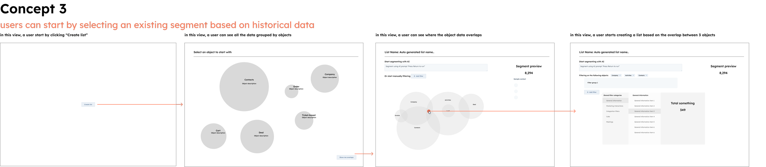
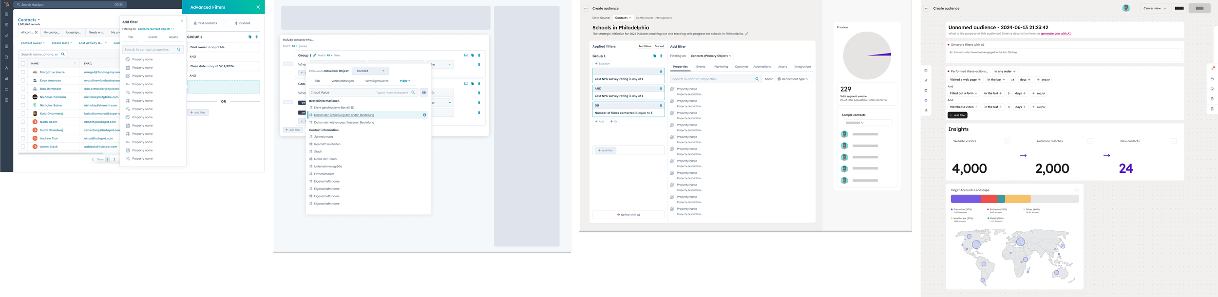
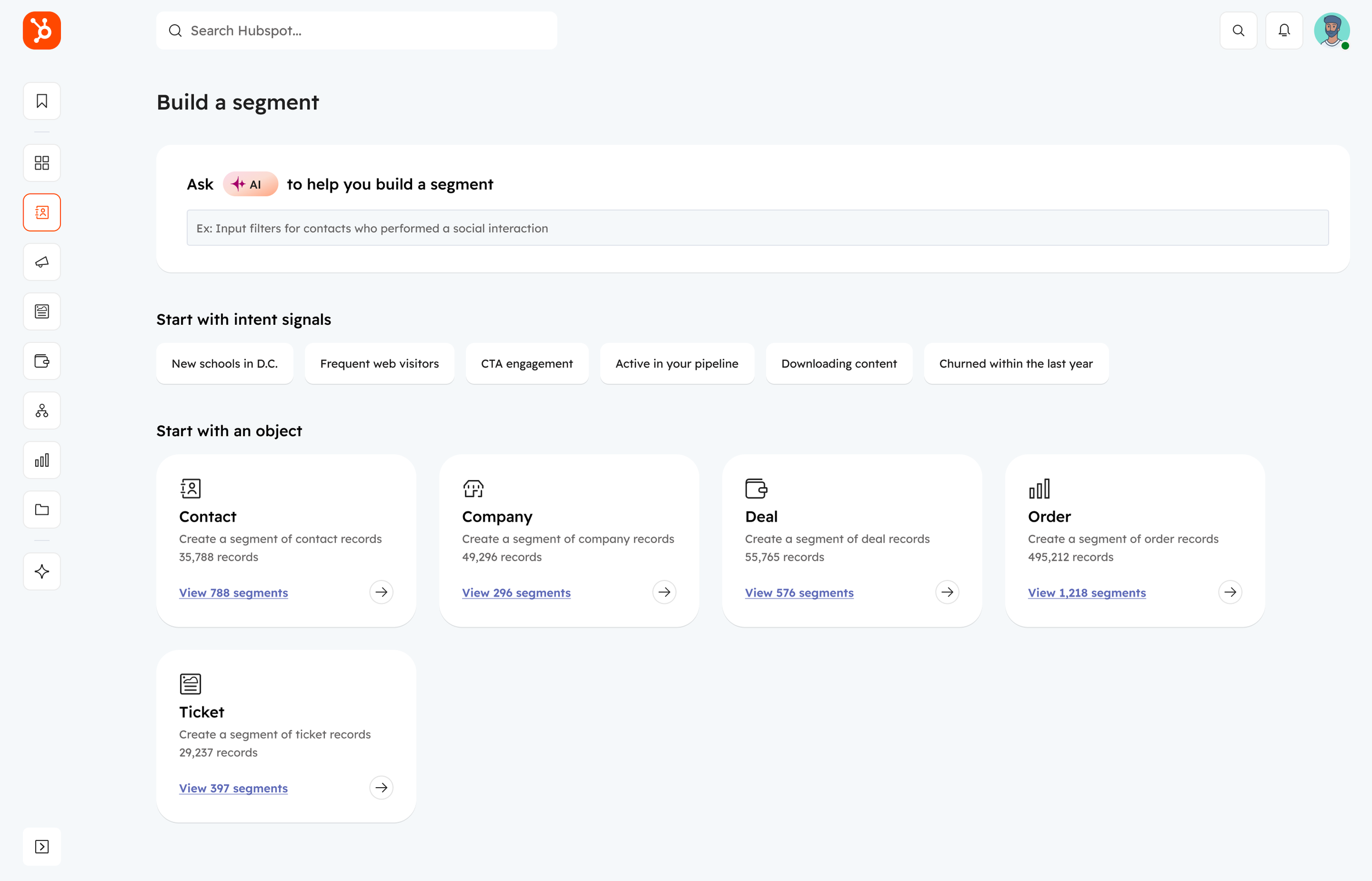
The redesigned segment home serves as a launching point for the updated experience. Customers can apply filters using natural language AI, leverage buyer intent signals based on historical data, or start by selecting an object.
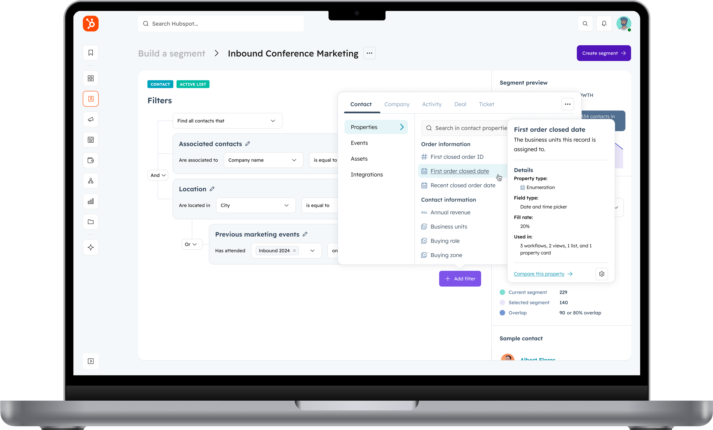
Segment builder
The segment builder consists of two core sections: the filters section, which enables users to refine and manipulate data, and the segment preview, which provides analytical insights to ensure the segment aligns with customer criteria.
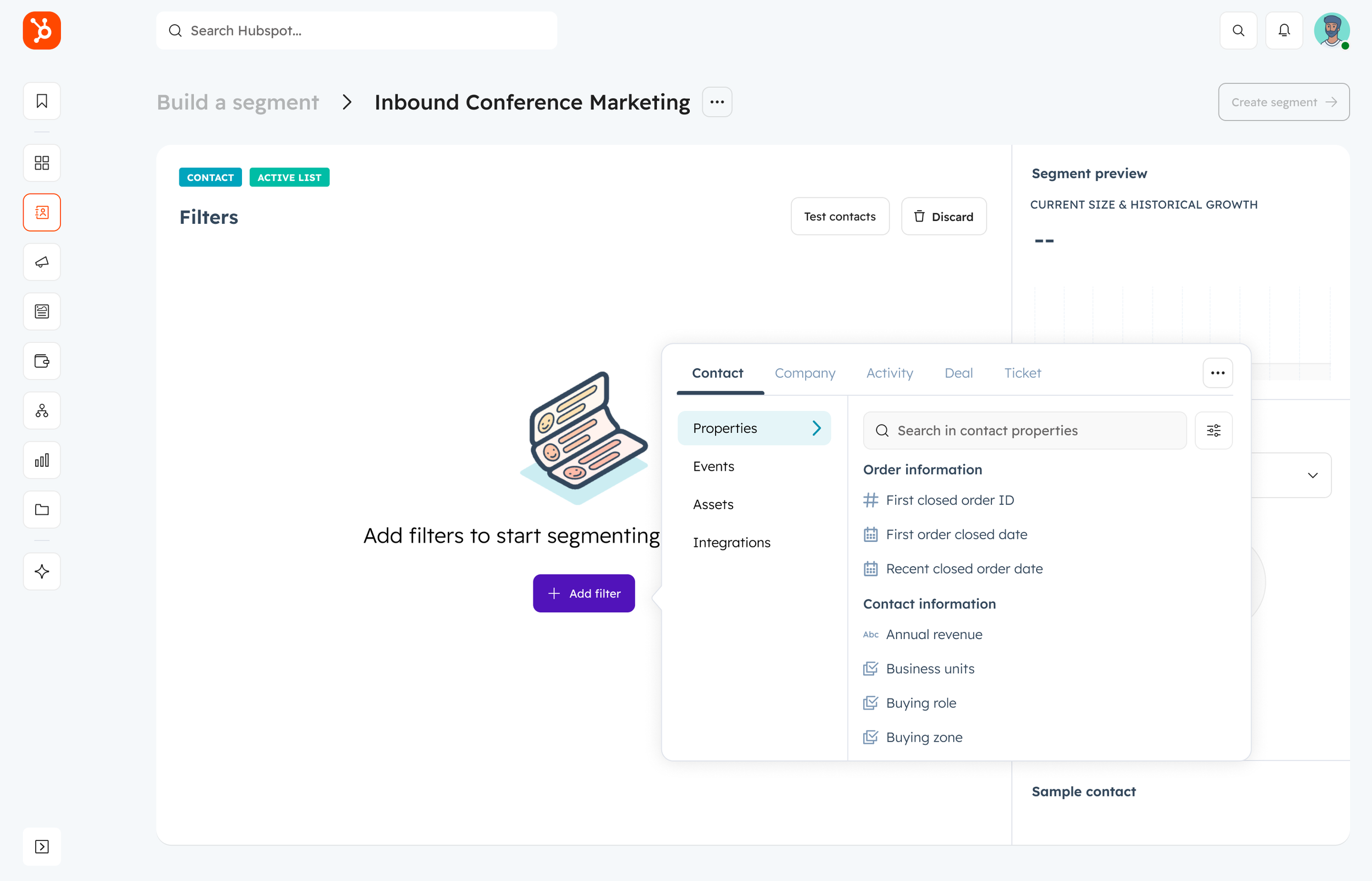
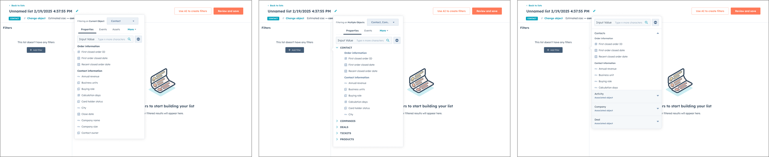
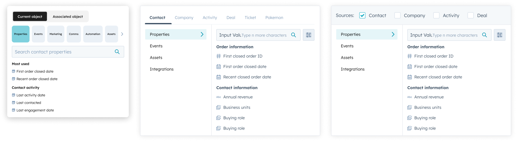
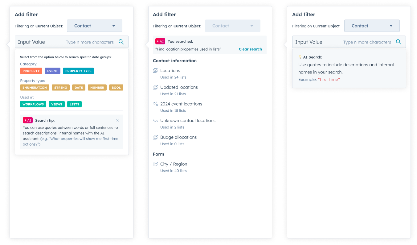
Enhanced filtering experience
Updates to filtering include a new information architecture, improved navigation, and contextual assistance, enhancing discoverability, usability, and comprehension.
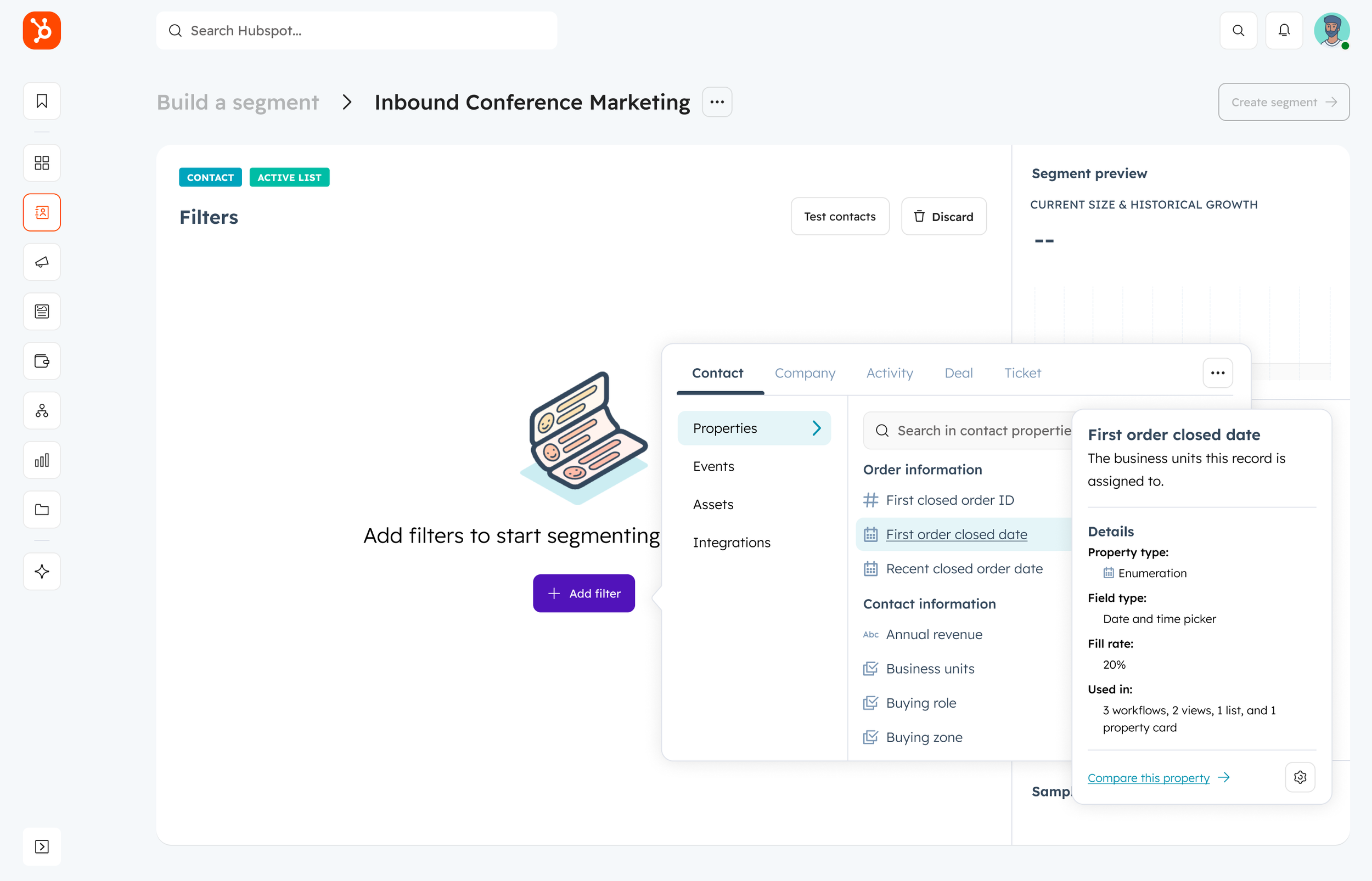
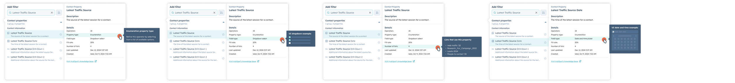
Property details information
This feature educates users on each property’s function, its role within an object, and the available UI inputs, ensuring clarity and better utilization.
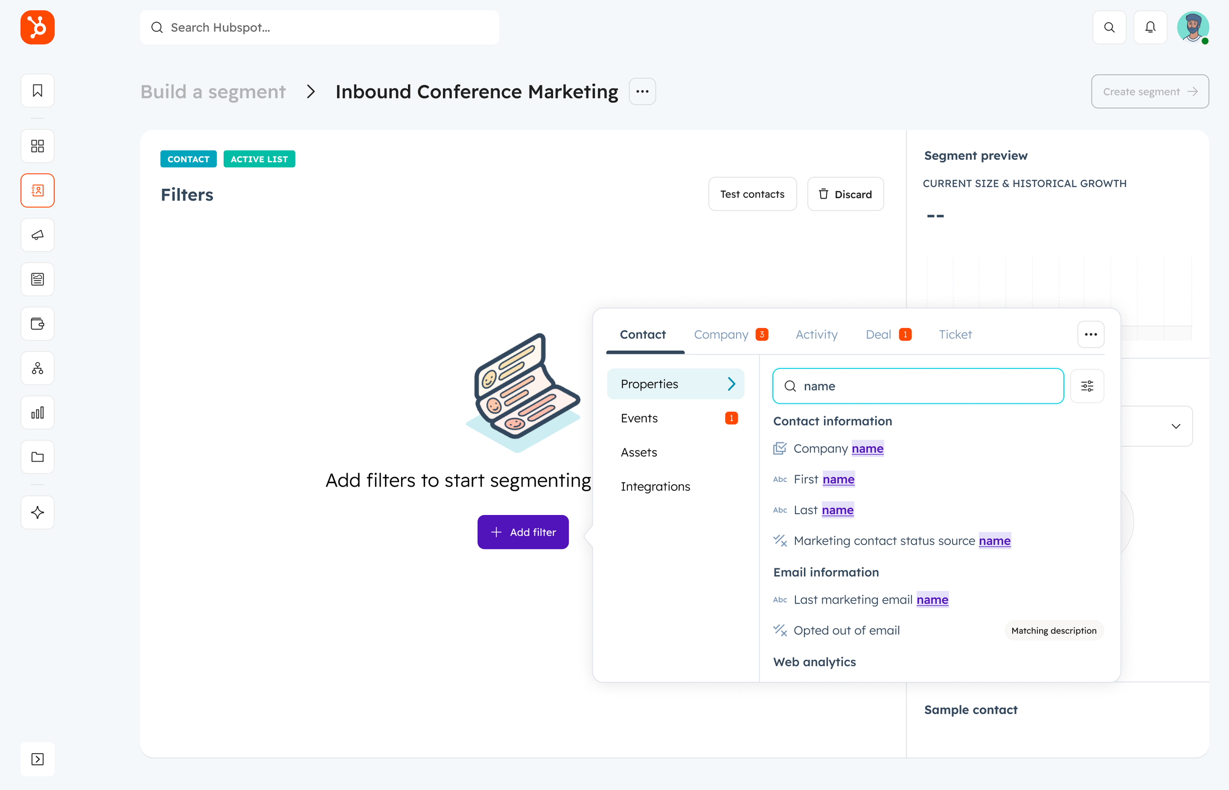
Hybrid search approach
Customers gain greater control over their searches with the ability to specify search locations within their database, guiding them to relevant information more efficiently.
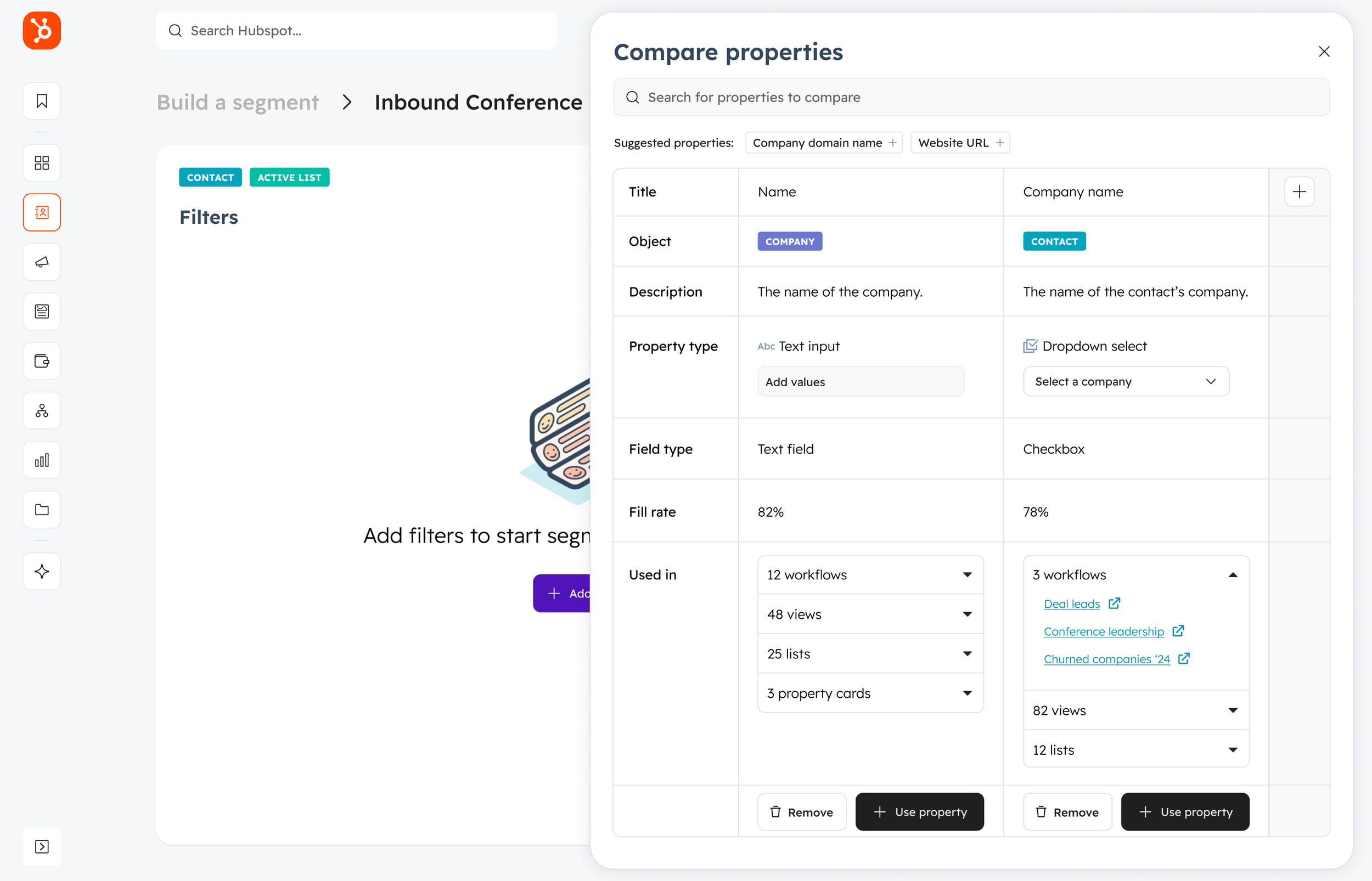
Property comparison feature
This enhancement reinforces the understanding of property usage, particularly when building reports and workflows, addressing the needs of users with varying levels of data proficiency.
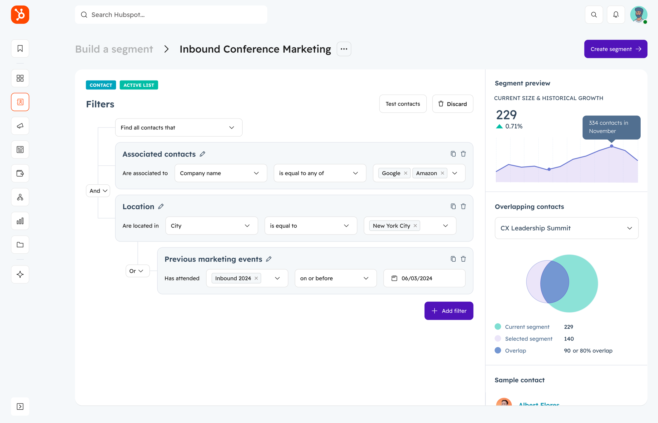
Flexible AND/OR logic
The final segment structure allows users to modify AND/OR relationships, enabling greater flexibility in exploring data relationships and refining results.
Delivery
I worked closely with my triad to plan small, manageable releases while keeping a backlog of improvements based on what we learned along the way. This helped us stay flexible and continuously refine the experience. At the same time, I collaborated with other design teams to validate our concepts, making sure they met user needs across different product groups. By sharing insights and working together, we created a more seamless and user-friendly experience that fit well within the larger product ecosystem.